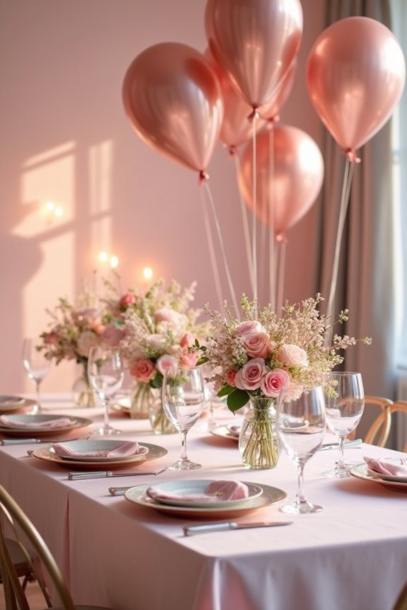
I’ll help you craft a pastel tablescape that welcomes any guest beautifully. Start by choosing three soft, complementary colors—like blush, mint, and lavender—and layer them through linens, runners, and napkins for visual depth. Mix textures such as crisp napkins with soft linens and shiny chargers with matte dishes to create movement. Arrange garden-style flowers like roses and peonies at varying heights, adding trailing greenery for sophistication. Season your palette choices to match the occasion, ensuring everything harmonizes seamlessly for an elegant celebration that’ll leave your guests impressed.
Quick Tips
- Start with a three-color pastel palette such as blush, mint, and lavender for an elegant foundation.
- Select seasonal palettes—spring pinks, summer blues, fall sage, or winter silvers—for cohesive design.
- Layer textiles, heights, and metallics to create depth and visual interest across the tablescape.
- Mix textures like linens, ceramics, and velvet to prevent a flat, one-dimensional appearance.
- Arrange garden flowers and greenery at varying heights to enhance your chosen color story.
Start With Your Pastel Palette
Three soft hues can completely transform your tablescape into something that feels both elegant and approachable.
I recommend choosing pastels that complement your occasion and venue. Soft blush, mint, and lavender work beautifully together, or I might select butter yellow with pale gray for a sunnier feel. The key is selecting colors that harmonize rather than compete.
I’d start by laying out your base color, then layer in two complementary pastels through linens, flowers, and accents. This thoughtful approach creates visual interest while maintaining the serene, sophisticated atmosphere pastels naturally provide. Consider adding stunning decorations that enhance your pastel color scheme and elevate the overall aesthetic of your tablescape.
Your guests will immediately feel the calm elegance you’ve created.
Pick Your Pastel Palette by Season
When you’re planning a tablescape, the season you’re celebrating in can guide your color choices in wonderful ways.
Spring calls for soft pinks, mint greens, and pale yellows that mirror fresh blooms and new growth.
Summer suits sky blues, peachy tones, and lavender that feel bright and invigorating.
Fall welcomes blush, sage, and cream that echo harvest warmth.
Winter invites icy blues, silvery grays, and pale golds reminiscent of frost and gentle sparkle.
Matching your palette to the season creates a tablescape that feels naturally cohesive and seasonally appropriate, making your celebration feel intentional and beautifully connected to the time of year.
Layer Your Pastel Tablescape for Depth
Once you’ve chosen your seasonal palette, layering becomes your secret weapon for creating a tablescape that feels rich and interesting rather than flat or one-dimensional.
I’m excited to share how strategic layering transforms your table into something truly special.
Consider these essential layers:
- Textiles: Combine linens, runners, and napkins in varying pastel shades to add visual texture
- Heights and shapes: Mix tall candlesticks with low floral arrangements to create dimension
- Metallics and accents: Introduce gold, silver, or copper elements that catch light and add sophistication
This approach guarantees your table invites guests into a carefully considered, welcoming space. Enhance your pastel tablescape with thoughtfully selected wine tasting party gifts that complement your design aesthetic and create memorable moments with your guests.
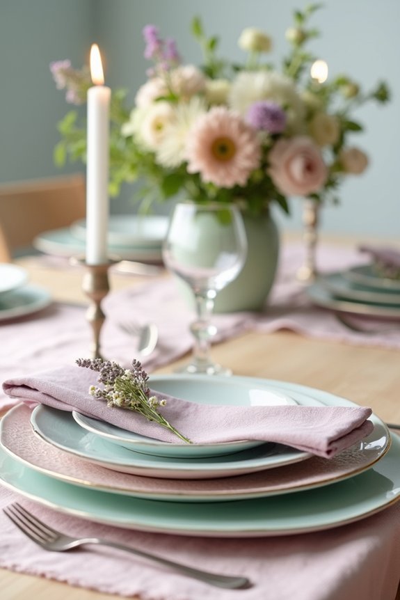
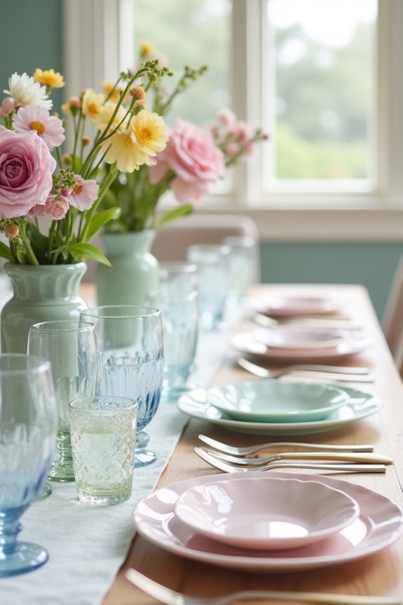
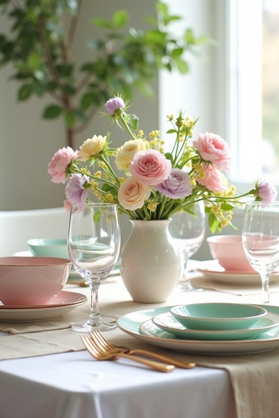
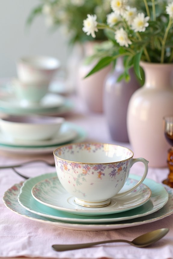
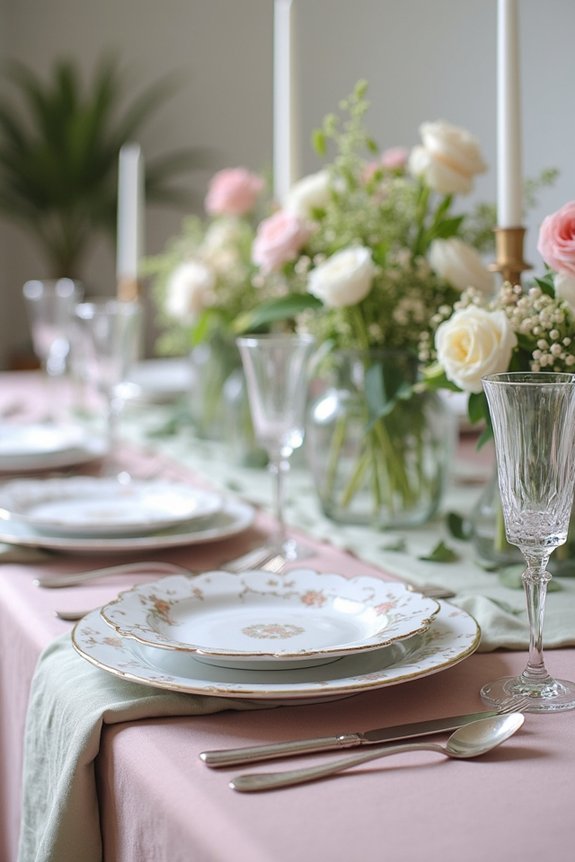
Mix Textures to Avoid a Flat Look
While layering creates depth with varying heights and colors, texture is what truly brings your pastel tablescape to life. I love combining soft linens with crisp napkins, smooth ceramics with woven placemats, and shiny chargers with matte dishes.
These contrasts make your table visually interesting and tactilely inviting. Consider adding velvet ribbons, lace runners, or burlap accents to your base linens. Mix glossy glassware with frosted candleholders.
The interplay between different materials catches light differently, creating movement across your table. This textural variety transforms a simple pastel palette into something truly memorable and sophisticated. Enhance your pastel theme with brunch party decorations that complement your tablescape’s textural elements and overall aesthetic.
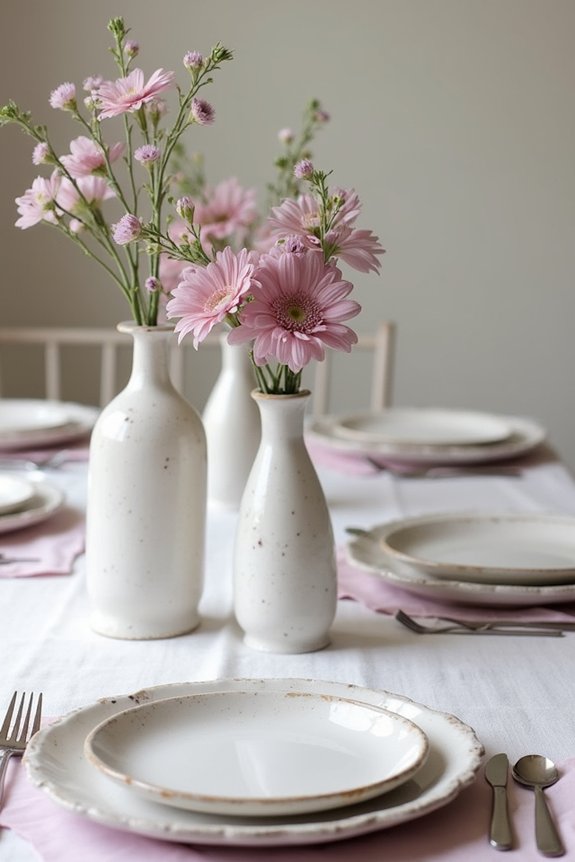
Arrange Florals and Greenery With Your Color Story
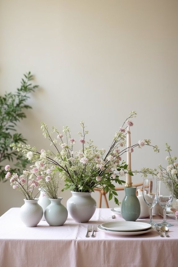
Now that you’ve layered in those beautiful textures, it’s time to anchor your tablescape with florals and greenery that speak to your pastel color story.
I’d choose blooms and leaves that enhance your chosen palette rather than compete with it.
Consider these options:
- Soft, garden-style flowers like roses, peonies, or hydrangeas in blush, lavender, and mint
- Trailing greenery such as eucalyptus or ivy to create movement and depth
- Filler flowers including baby’s breath or waxflower to soften arrangements
Arrange stems at varying heights, allowing some to spill gracefully over container edges.
This creates visual interest while keeping your color story cohesive and intentional.
Finish With Dinnerware and Glassware
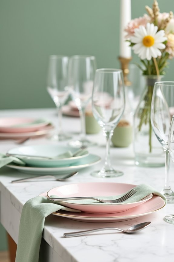
Your dinnerware and glassware are the final pieces that tie everything together, and I want you to choose pieces that honor your pastel palette without clashing with the florals and textures you’ve already layered in.
Consider soft-hued plates in cream, blush, or sage that complement your color scheme. Clear or frosted glassware keeps things feeling light and airy.
I’d recommend mixing metallic accents like gold or rose gold flatware to add subtle elegance. These finishing touches elevate your table while maintaining that cohesive, dreamy aesthetic you’ve worked so hard to create. For an even more polished gathering, consider incorporating game night games that complement your tablescape aesthetic and entertain your guests throughout the evening.
Adapt Your Pastel Tablescape for Any Event
The soft color palette and delicate aesthetic work wonderfully across countless occasions, from intimate bridal showers to casual garden parties to elegant holiday dinners.
I love how adaptable pastels truly are! Consider these adjustments:
- Seasonal swaps: Use spring florals for Easter brunches, autumn leaves for Thanksgiving, or evergreen accents for winter celebrations.
- Formality levels: Keep things relaxed with mismatched vintage pieces for casual gatherings, or go sophisticated with coordinated linens for milestone events.
- Theme integration: Layer in metallics for glamorous parties, add playful patterns for children’s celebrations, or incorporate romantic elements for anniversaries.
Your pastel foundation becomes the perfect canvas for any event you’re planning. Enhance your table settings with thoughtful breakfast party favors that complement your pastel theme and delight your guests.
Frequently Asked Questions
How Do I Prevent Pastel Colors From Looking Washed Out in Photography or Dim Lighting?
I’ve battled this lighting challenge countless times—pastels fade to nothing while bold colors steal the show. I layer textures, add metallic accents, and use strategic lighting to make delicate hues pop brilliantly in every shot.
What’s the Best Way to Store Delicate Pastel Table Linens Between Uses?
I fold my linens loosely with acid-free tissue paper between layers, then store them in breathable cotton bags away from direct sunlight. This prevents creasing and color fading, keeping your pastels pristine for your next gathering.
Can I Mix Metallics With Pastels, and Which Metals Work Best?
Absolutely—I blend metallics with pastels constantly. Gold whispers elegance against soft hues, while silver brings modern sophistication. Rose gold? That’s my secret weapon for romance. I’d skip brass; it clashes with pastels’ delicate nature.
How Far in Advance Should I Shop for Seasonal Pastel Decorations?
I’d recommend shopping 4-6 weeks before your event. This timing lets me snag the best seasonal pastels before stores sell out, giving me flexibility to change my vision if needed.
What Budget-Friendly Alternatives Exist for Expensive Pastel Table Linens and Runners?
I’ve discovered that budget-friendly alternatives are like hidden gems waiting to sparkle your table. I use affordable fabric from big-box stores, dye plain linens with tea or natural dyes, and layer pastel-colored bedsheets creatively for stunning results.